Hello and welcome to my portfolio. My name is Justin Erickson, I am a multidisciplinary Illustrator and Graphic Designer.
Throughout my career I have worked in various niches within the design industry. My portfolio showcases samples from some of my favourite projects, case studies, and commissions related to the different genres of graphic design I have worked in. Ranging from text layout design, logo design, packaging, print design, branding, and more.
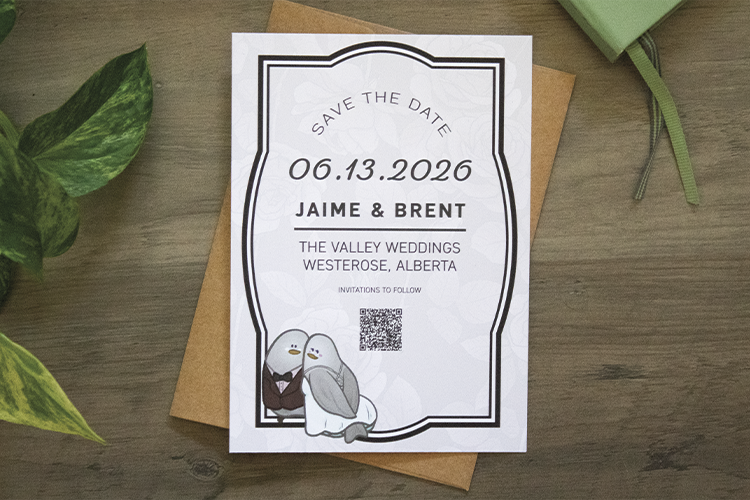
Invitation Design
Throughout my career I have designed invitations for a variety of events, from weddings to housewarmings. The following is a collection of a few of my favourite invitations.


Designing for a Modern Alpine Theme
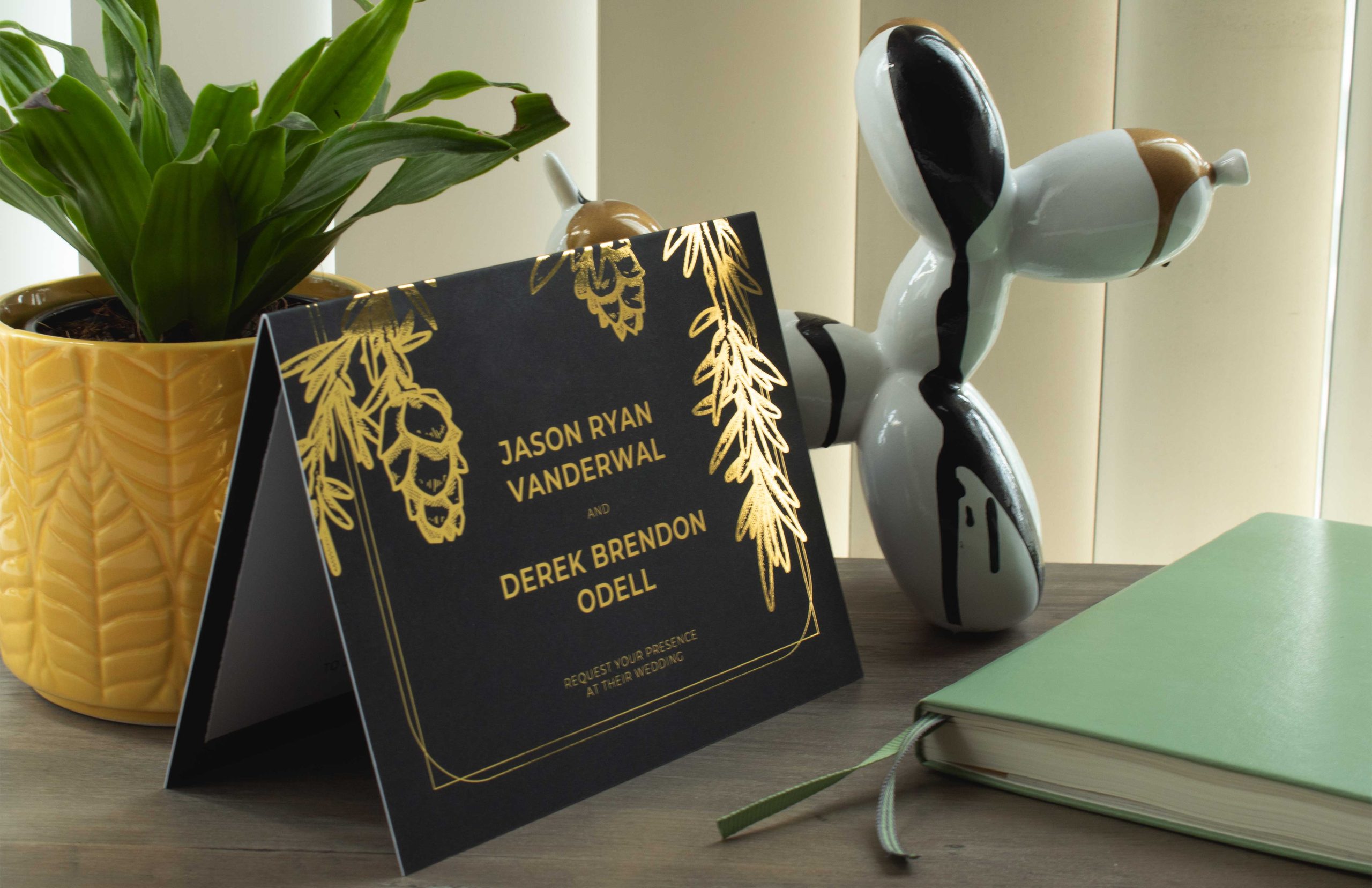
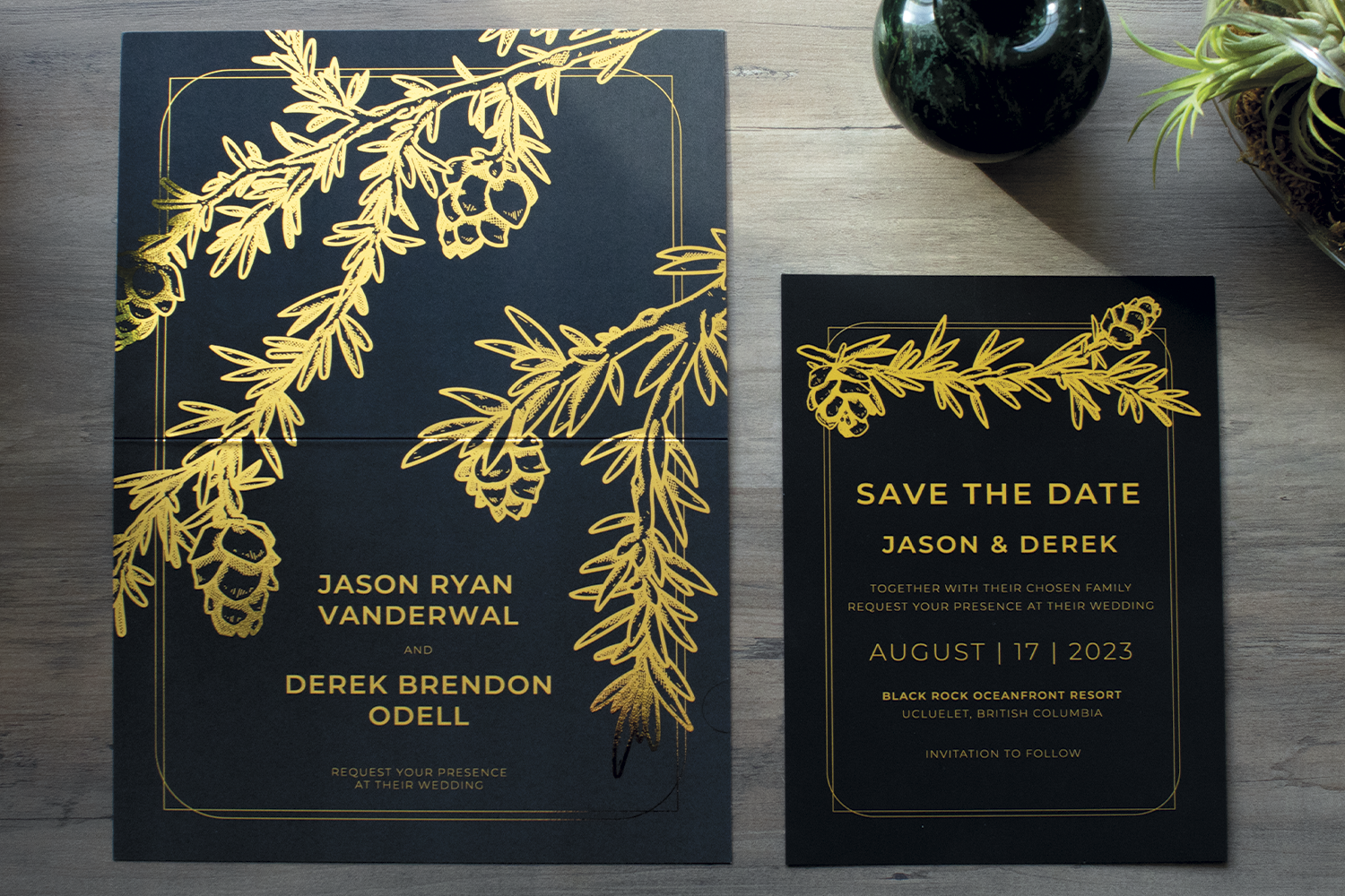
When I was approached by Jason and Derek to design their wedding invitations I was presented with a challenge to combine a sleek modern aesthetic with the outdoors. They were unsure how to approach the idea without being too literal.
The grooms had decided on an alpine and greyscale theme with gold accents for the wedding. And asked that the theme be consistent throughout the save the date and the formal invitations design.
I presented the couple with a few options with varying motif’s, illustrated river rocks, and coniferous trees over a misty backdrop, but they ultimately decided on a design featuring illustrated sprigs of pine. The design evolved from there to utilize gold foil on black card stock.
The design was utilized on their Save the Dates as well as the formal invitations.
I presented the couple with a few options with varying motif’s, illustrated river rocks, and coniferous trees over a misty backdrop, but they ultimately decided on a design featuring illustrated sprigs of pine. The design evolved from there to utilize gold foil on black card stock.
After the invitations were finalized and sent to the printers the grooms added to the scope of work, requesting an additional design for a hand fan that they intended to give out to their guests as party favours.
Due to the manufacturers printing limitations the fans utilize a simplified version of the illustrated pine branches. By adhering to the grooms grayscale colour scheme it allows the hand fan to be unique but still fit into the overall theme of the wedding.
Throuout this entire process it was so much fun designing around a them we coined Modern Alpine.
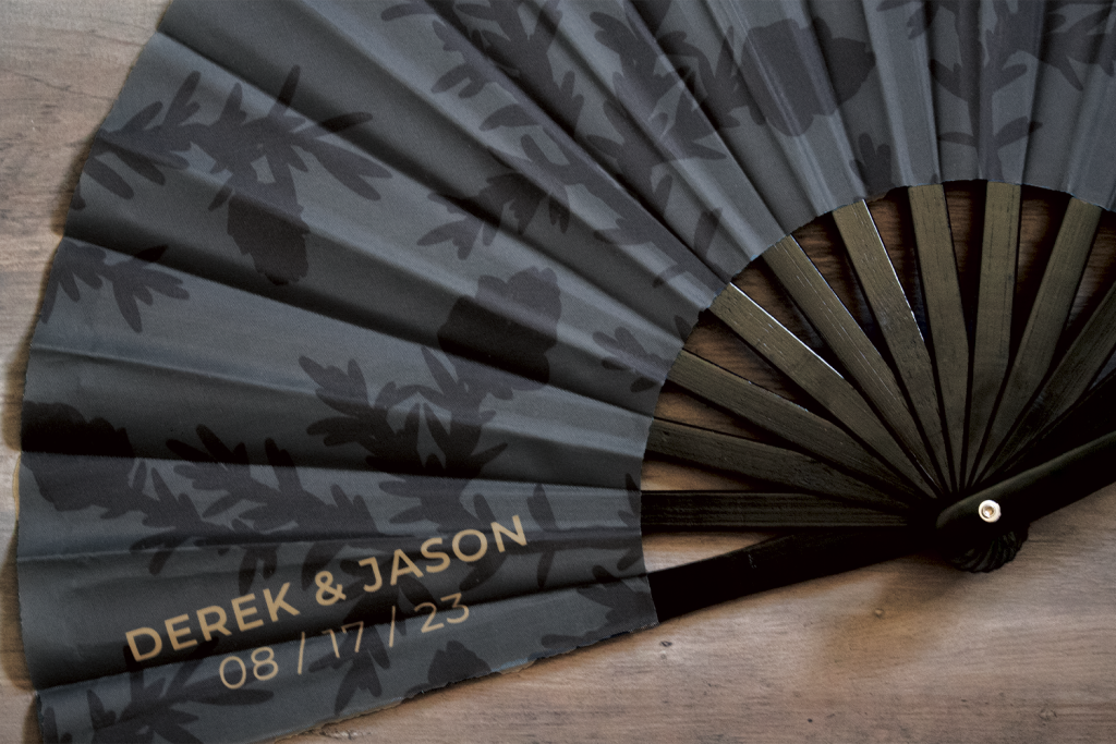
I heard afterwards the invitations were a huge hit with the guests and I can only imagine how loudly these fans clacked throughout the celebration.
Designs from my Time with Eclipse Awards
I worked with Eclipse Awards International as a graphic designer between 2021 and 2024. During those three years I learned how to design for sandblasting, laser engraving, and UV printing on various materials.
Due to ongoing NDA’s, I am only able to show a handful of examples of the work I created during my time with Eclipse Awards.
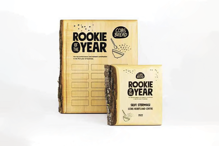

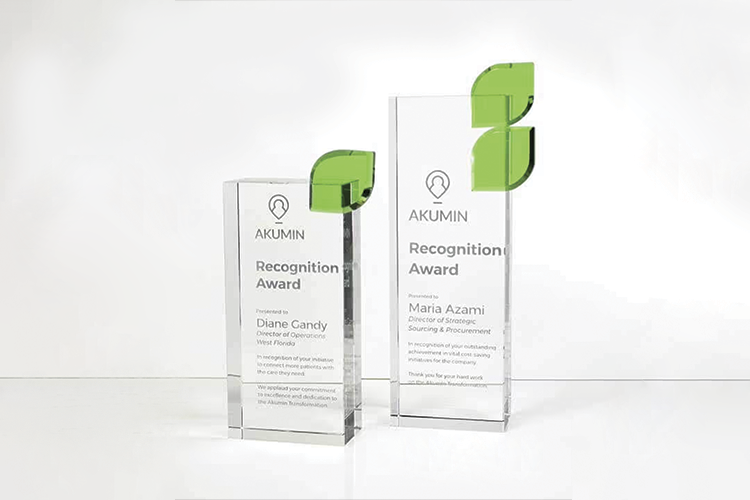

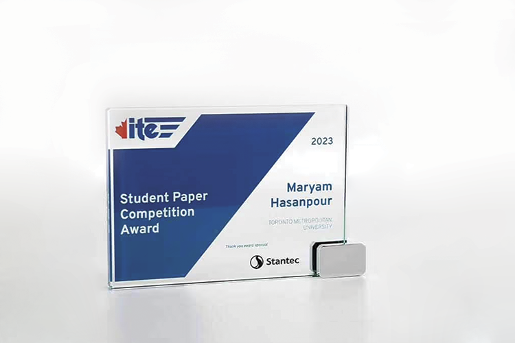


Overall the experience changed my perception of what an award could be. It has given me a new appreciation for the amount of time and effort that goes into awards, and a better eye for typography.
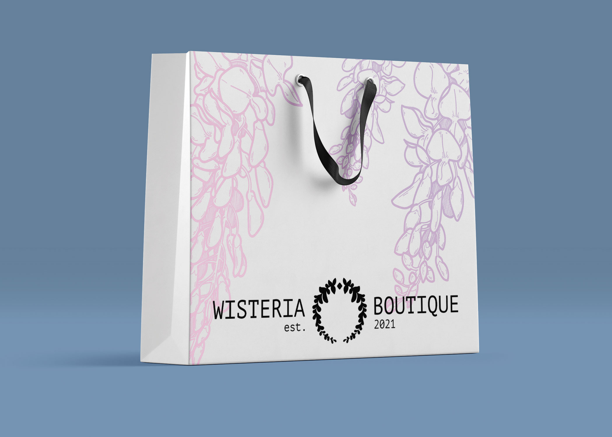
Packaging Design
Some of my all time favourite projects include packaging design. The challenge of creating under size restrictions, material limitations, etc. scratches my brain in the best possible way. I love a good puzzle, and making that puzzle look good is a reward all on its own.


All New Packaging for my own Products
Recently I decided it was time to upgrade my own packaging, it was a very overdue task I had let sit on my backburner for a little too long.
As a designer it can be difficult to work for yourself and apply your learnings to your own business. I had a mental block around it for years until I presented it to myself as a challenge.
My goal was simple. Improve the unboxing experience and go plastic free.
Labels for a Series of Ghost Story Themed Candles
Pearl Candle Co. found me through social media and asked if I would be interested in designing a series of labels for an upcoming product launch planned for halloween. Each candle would be themed around a popular Hollywood ghost stories.
Who doesn’t love a good ghost story?
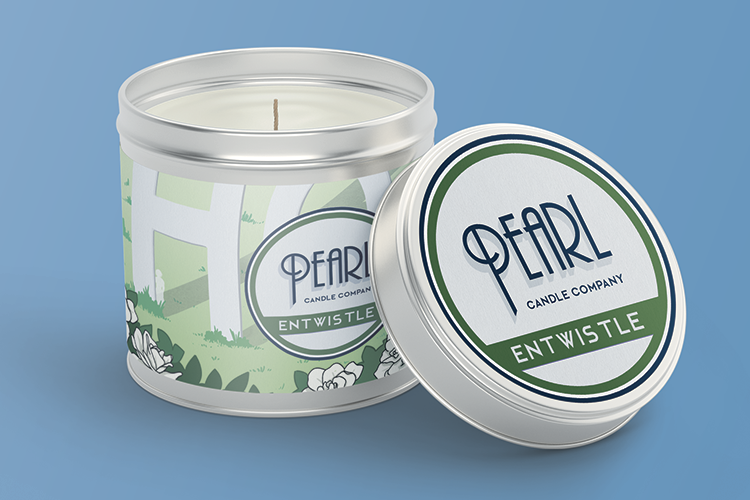
Entwistle
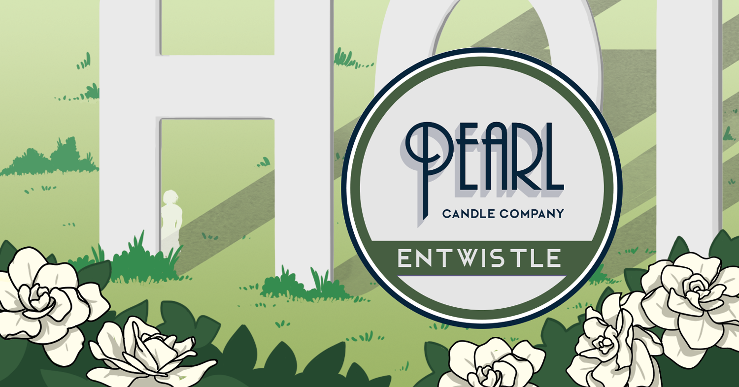
*Trigger Warning* This next candle focuses on Peg Entwistle’s tragic story involving the Hollywood Sign. The label features the H, O, and first L in the hollywood sign addorned with gardenias.
It is unclear if Peg had any difficulty with her mental health, but on September 16th 1932 she decided to take her own life by jumping from the H of the Hollywood sign.
It’s said she still wanders the park and that the smell of gardenias preludes a sighting.
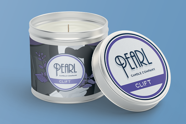
Clift
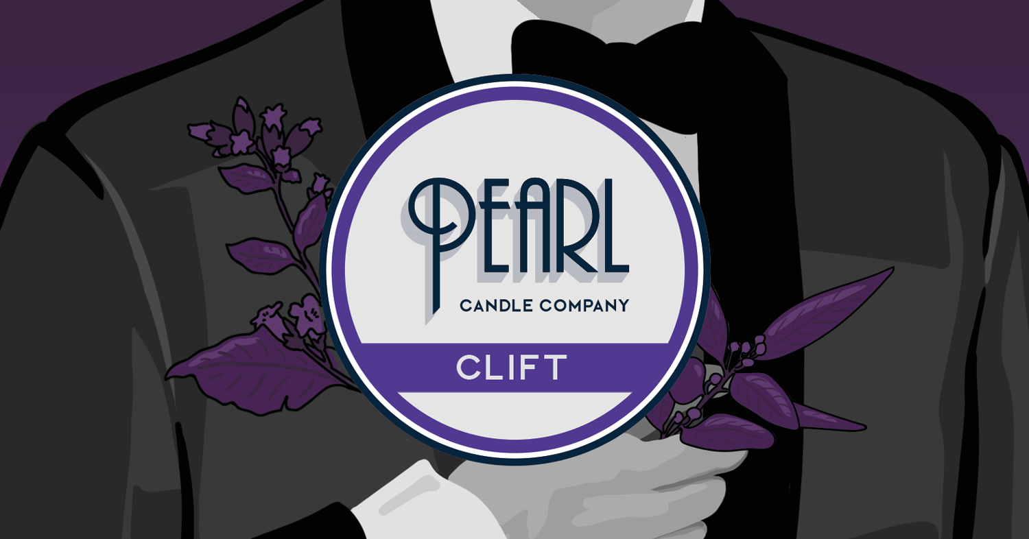
Based on Montgomery Clifts story, an American actor best known for his role in Howard Hawks “Red River” and suffered an untimely death at the age of 45.
It’s said he haunts room 928 at the Roosevelt Hollywood hotel. Sightings are often followed by the scent of tobacco and bay leaves, bugle music, shuffling feet, and whispering.
The label features a finely dressed man holding a sprig of tobacco, and bay leaves in his hand.
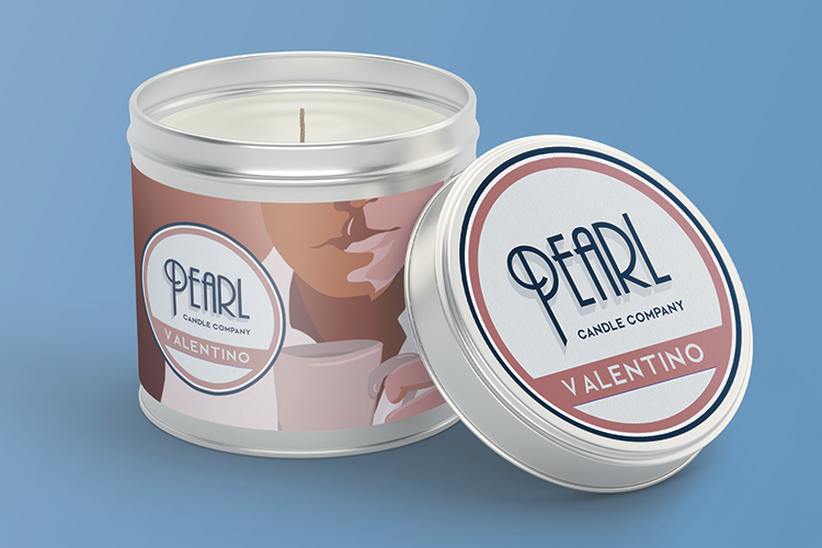
Valentino
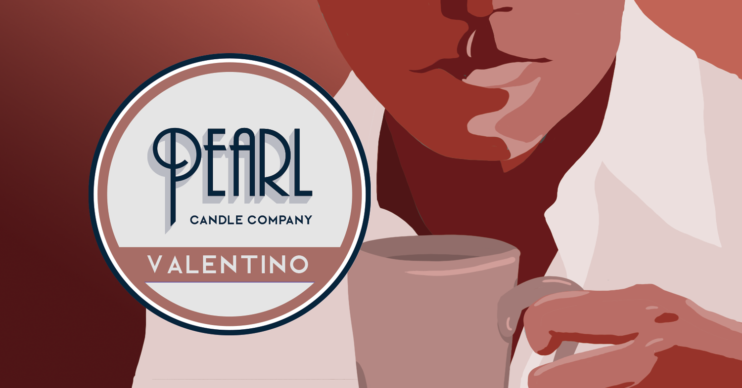
The last candle features the story of Rudolph Valentino. One of the most popular international stars of the 1920’s and credited as Hollywoods first sex symbol.
The label showcases rosy colours and a stylized illustration of Valentino enjoying a mug of rosewater tea. His beverage of choice.
It is said that if you leave roses at Rudolphs grave you’ll notice the smell of rosewater throughout the day.
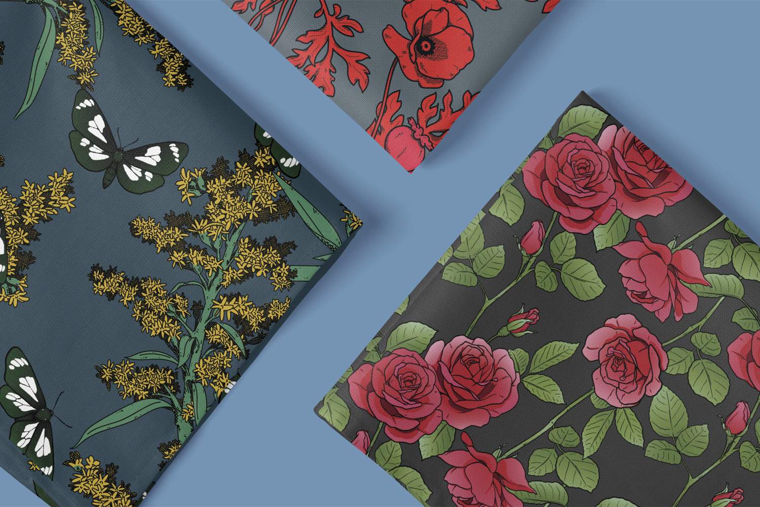
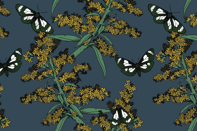
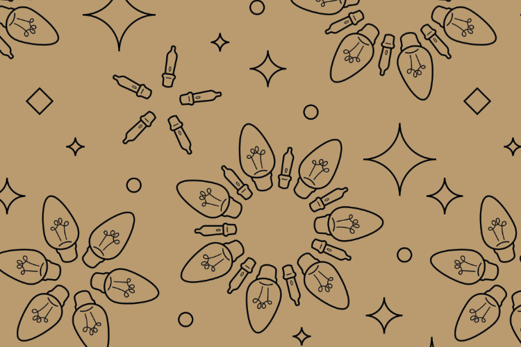
Surface Pattern Design
This section of my portfolio focuses on surface pattern design. Each pattern starts off as sketches and is later digitized, or reilistrated in a vector format. Each design is custom made with multiple applications in mind, such as textiles, wrapping paper, packaging, and home decor.
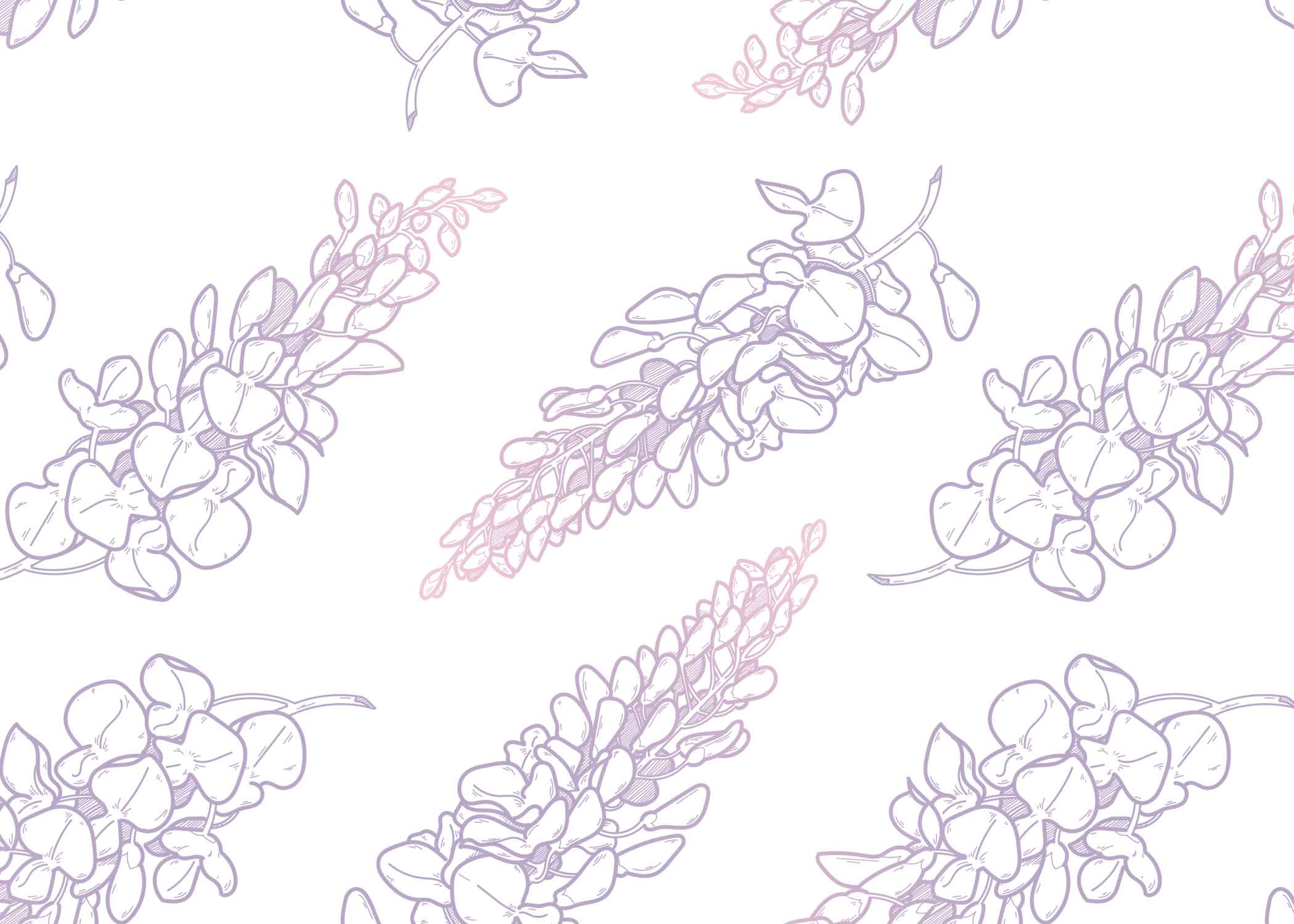
Repeating Floral Patterns


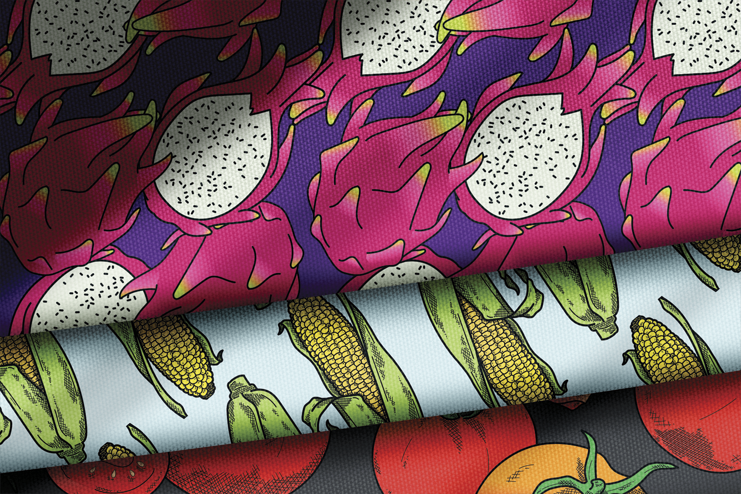
Produce Themed Patterns


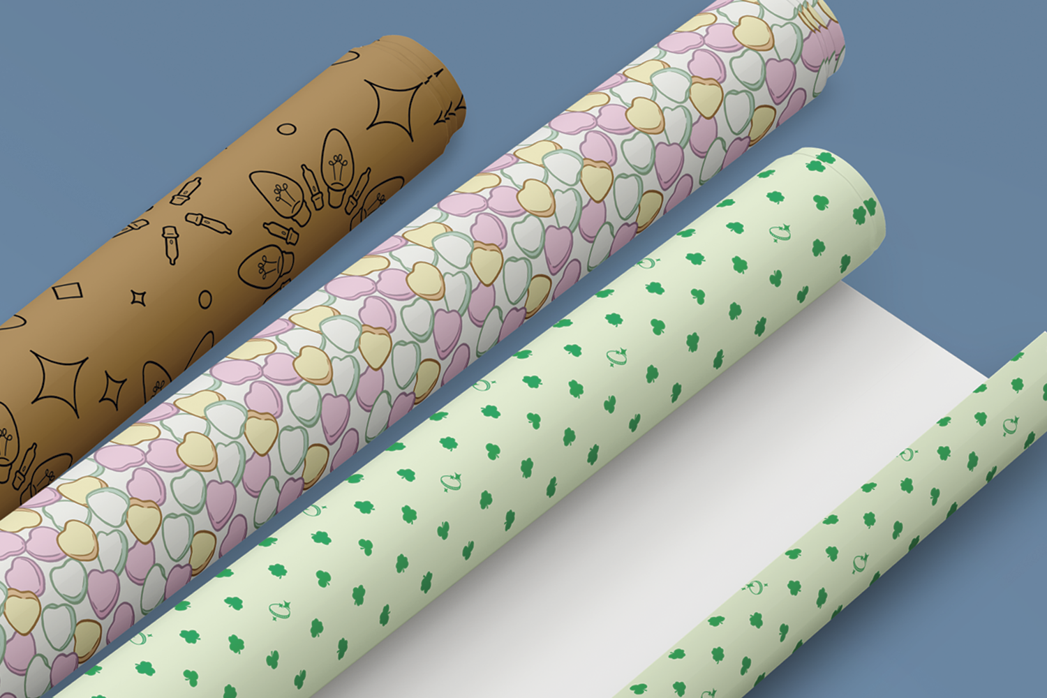
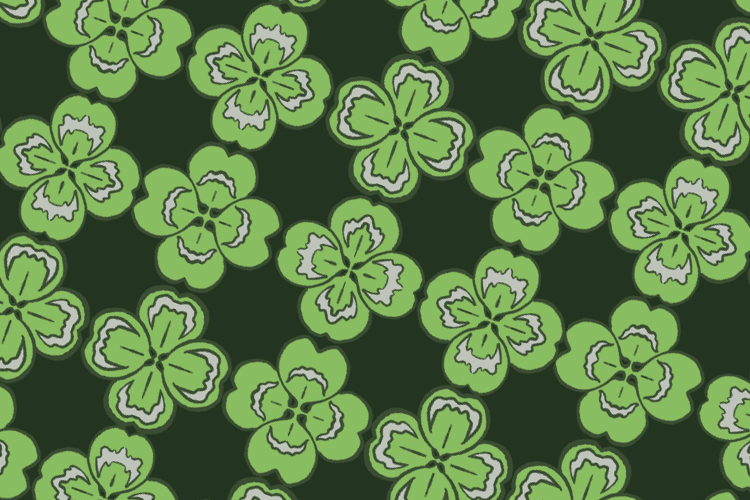
Seasonal Surface Pattern Designs


Logo Design
In this section of my portfolio you will find a variety of logo designs.
Brand Development for Oats Dates & Honey Cakes
Oats Dates and Honey Cakes is a start up bakery in Edmonton Alberta. Featuring a wide variety of gluten free baked goods.
I was tasked with creating a logo, branded packaging, and miscellaneous business collateral for the bakery.
Packaging Design
Using the name as inspiration, we went with a modern pallet showcasing bright yellow, and a warm honey coloured orange.
The packaging and the business collateral feature illustrations Inspired from the businesses name. Adorning honeycomb, dates on the branch, and sprigs of oats.
Custom Valentine’s Day Pattern
For Valentine’s Day, I was asked to create a themed custom pattern for their food safe tissue paper used in the treat boxes.
Restricted to two colours, the pattern featuring cake pops, chocolate truffles, cupcakes, and candied hearts.
There are more planned for Halloween and Christmas.


Business Collateral


Thank you for taking the time to explore my Portfolio.
If you would like to ask about commissions, licensing, or anything else. Please email me directly or use the form below. I will get back to you within 24 hours.
Stay Creative,
Justin Erickson